Have you ever wondered ‘…how can I put my exhibit on a touchscreen?’
What would you feature on the first page? How would people navigate the content?
Take a deep breath, it’s not actually difficult to answer these questions. You don’t have to be a tech wizard. We regularly grapple with touchscreen and app design and one of the first steps is super simple.
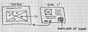
Develop a wireframe.
‘A wireframe is a two-dimensional illustration of a page’s interface that specifically focuses on space allocation and prioritization of content, functionalities available, and intended behaviors. For these reasons, wireframes typically do not include any styling, color, or graphics.’
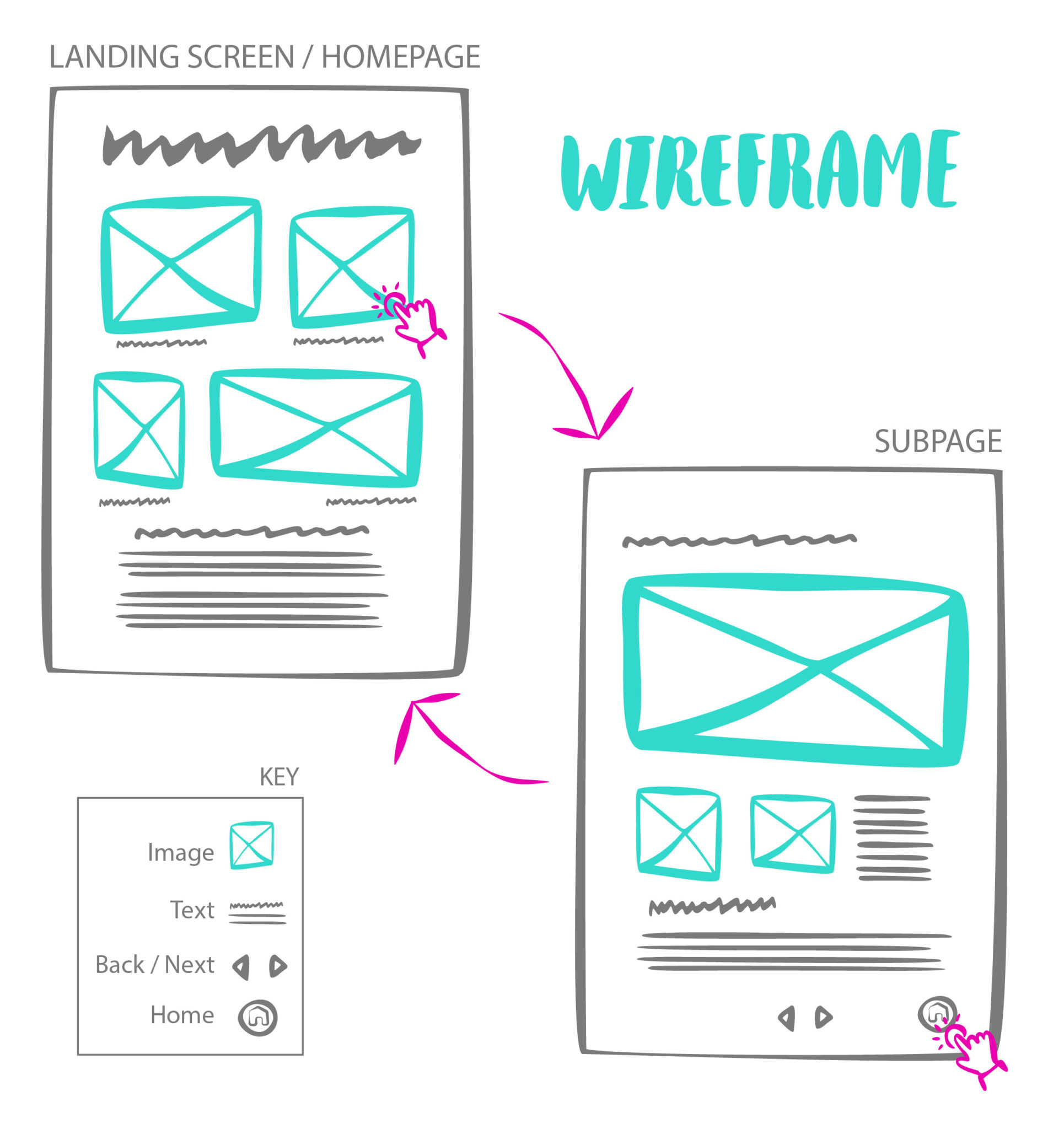
In fewer words, wireframes are basic drawings showing what goes where. They help us and our clients map an experience. *just because the wireframe has a lot of rectangles, or the experience looks linear, that doesn’t mean the content or presentation is*
Once we know what stories we’re sharing, we start sketching how they might be told in a touchscreen. We consider the homepage first. How will we (metaphorically) zoom back and present a macro view of the content here? What pages should visitors go to next? While putting pen to paper, you might visualise the screen and experience. Ask yourself, would I want to tap on this page? Is there too much content? Do I understand where the experience will go if I tap here ?
By drawing wireframes, you can uncover the flaws in a design before you’ve invested time and money. Laying out a beautiful page or experience that isn’t functional (or is missing content) can be avoided with a basic wireframe exercise.
Starting your designs with a wireframe also makes concepts easy to share and refine. Spending hours programming and testing an experience for a stakeholder to provide their first round of feedback isn’t efficient. Aim to have them weigh-in on the wireframe. Finding and fixing glitches later is a morale-killer.
You can apply wireframes to mapping any exhibit content. It doesn’t matter if the subject is eco-systems, trains, lifesaving or dinosaur digs.
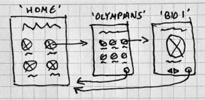
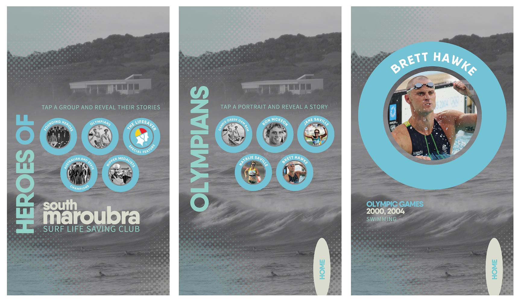
Case Study: South Maroubra SLSC touchscreen. People-based format that flows from a macro view of roles in lifesaving and the club’s history to individual biographies. Landing page encourages people to dive into Founding Member or Olympian stories, for example. The visitor’s focus is then narrowed and they can select a particular person’s biography.
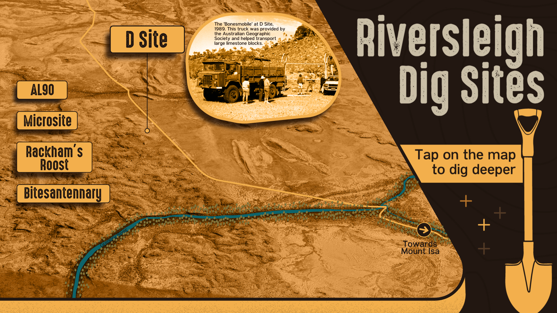
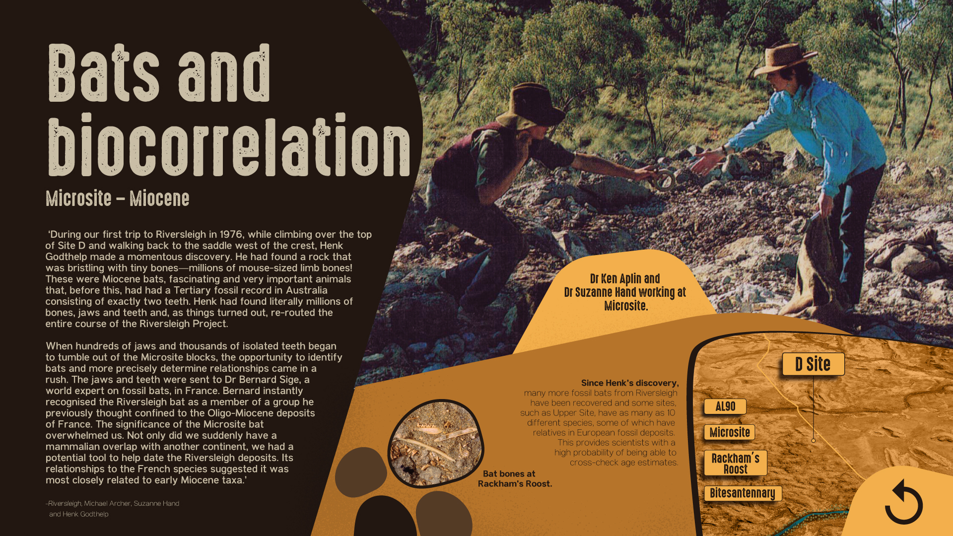
Case Study: Riversleigh Dig Sites touchscreen. The layout for the experience is geographic. Visitors choose a location on a map and then ‘dig’ deeper into that site’s history. The wireframe features the usual rectangles and arrows but the content isn’t laid out in a grid.
